It's funny, you take the 'is' out of raise and you insert a 'z' and the word becomes the opposite of what it means even though the pronunciation is still the same--English is funny like that, but I digress.
So why raze the proscenium arch? What the hell is the proscenium arch? Anyone who is familiar with theater and how stages are set up know that the proscenium arch is the "window to the stage." It is the framing of the stage and where the composition of the stage is realized to the audience; it is what the audience see. This is a film blog, so why am I babbling about the mechanics of theater?
In film history 101, you will most likely be given a brief introduction into theater because it is the precursor to film. You will eventually learn about the proscenium arch. Why is it important? The framing of a shot is much like the framing of the stage. Whereas the stage director uses the proscenium arch to control what the audiences see, the film director uses a camera to fulfill this same purpose.
So what is the problem with the proscenium arch? It is not a problem with the proscenium arch per se, but how certain film directors intentionally or unintentionally frame a shot like they were directing a stage production.
Although there are myriad examples of movies that abuses this framing technique, the most egregious offenders are horror films. You've seen it. A scene where a character is standing alone in an empty room surrounded by cobwebs, shattered mirrors, and a creaky floor. The camera pans and suddenly out of nowhere someone jumps into frame and frightens the bejesus out of our horrified character. This is the abuse of the proscenium arch-like framing. On the stage, the fiction of the world is confined within the proscenium arch. On film, the world isn't limited to the frame. There is an agreement between the audience and the director that there is a world that exist beyond the frame; and that this world behaves much like our very own. So with that in mind, our lone character standing in the empty room would've noticed the person creeping up on her even though we do not see them in the frame. These panning jump scares are cheap and antiquated techniques some filmmakers are still utilizing for suspense.
Another framing abuse I despise started with the first Final Destination movie (maybe another film did it first but I personally remember seeing it for the first time here). The framing of the scene has a medium shot of a female character verbally lashing out at her friends before deciding to step out onto the street. Once on the street she is immediately struck to goo by a speeding bus. Sure, pretty effective sequence to shock and rattle the nerves but again, it frames the shot like a proscenium arch dismissing the realities of the surroundings and the bigger world outside the frame. This framing technique has been done to death in films like Constantine, The Orphanage, The Devil's Reject, Edge of Darkness, and countless others...it definitely needs to be put out pasture much like the shaky cam without POV and ADD editing.
Evolving filmmakers need to understand that the world beyond the frame needs to be respected and treated like the real world. It is this inherent connection that makes the believability of the fictional world told through the lens that much more convincing and engaging. Keep the proscenium arch directing style mentality on the fukin' stage.
Thursday, February 3, 2011
Friday, April 9, 2010
A Gun is a Range Weapon Right? Film Logic Rant 01
Ever since the advent of cinema, audience imaginations have long been captivated and seduced, losing themselves to the story by witnessing the impossible and amazing feats performed in the world of the celluloid. As an audience hungrily devouring a movie, there is this unspoken agreement that actions happening within this fiction does not necessarily pertain to the real world. After all, this is the movie world; a hyper-semi realistic depiction of a reality much like our own wherein the laws of physics, logic, and common sense are sometimes singularly or altogether dismissed. Film logic as we call it is a natural offspring of this agreement.
The topic of film logic is multitudinous and so it would be silly for me to try and cover all the aspects that it presents. I'm sure there are film scholars or more articulated bloggers out there in the inter-web whom have written dissertations on it -- I assure you, I am not he. This is by no means an academic discourse on film logic...I am no expert. But I am a geeky raving film-going lunatic (no I'm not living in my parent's basement) so I will occasionally sprinkle Celluloid Fury with rants on certain film logic that never ceases to piss me off.
Before I begin let me start with this, there are two types of film goers: ones who enjoy movies because it gives them a sense of wonder by making the unattainable attainable. They just want to experience something they don't normally experience in real life. Film is a fantasy; it is not hampered by physical restrictions or creative limitations -- leave your brains at the fucking door and just let the story take you to a place otherworldly. And then there are ones who expect a little more in their movies. Not because they feel entitled to it, but because they expect film to evolve in it's storytelling techniques.
Obviously I agree with the latter. Since Birth of a Nation (1915), cinema has been thriving for almost a century. You'd think that filmmakers and their storytelling methods would have evolved by now. Audiences are much more educated and film savvy and yet we are still inundated with antiquated blunders that can render a decent television show or movie laughable because of the intentional or unintentional inheritances of film logic.
One in particular that has constantly annoyed me is when characters uses a gun unlike a gun. I'm pretty sure that guns, "a weapon consisting of a metal tube, with mechanical attachments, from which projectiles are shot by the force of an explosive" (Dictionary.com) are meant to be used as ranged weapons. Used any other way and they cease to be effective. For example take this screen shot:
Villain has heroin dead to rights at point blank range. We all know what happens next right? Heroin kicks the gun from villain's hand and a furious fight ensues. Hey, I'm all for a good cat fight between two sexy honeys, but I digress. If the villain (in this case Whiskey) stood a few feet back, our heroin (Echo) probably wouldn't have had a chance in hell deflecting her attack. But then Echo would be dead and there wouldn't be much of a story right? It's all too common that filmmakers set the main villain up as a brilliant mastermind only to dumb them down in the end by having them perform acts of stupidity. The gun used as a blunt instrument during close quarter combat is prevalent in many action oriented movies and television shows and Dollhouse is no exception (but so far it is the most egregious offender and hey, I love Dollhouse...but I could love it that much more). Personally, I feel that this tiresome plot device has worn out its welcome.
So how can filmmakers rectify this problem? I don't know, maybe write better screenplays? And I don't say that to be brash. Screenwriters make serious dough, it's what they are paid to do...there's no crying here. We have almost a hundred years worth of film history for research. Study it...evolve it...make the experience fresh again. That is the trick isn't it?

Mathew Vaughn's "Kick Ass" is about to be release next week. It has tons of villains with guns and heavy firepower. I'm curious to see how Hit Girl and Big Daddy overcome this adversity. I hope they kick ass properly.
The topic of film logic is multitudinous and so it would be silly for me to try and cover all the aspects that it presents. I'm sure there are film scholars or more articulated bloggers out there in the inter-web whom have written dissertations on it -- I assure you, I am not he. This is by no means an academic discourse on film logic...I am no expert. But I am a geeky raving film-going lunatic (no I'm not living in my parent's basement) so I will occasionally sprinkle Celluloid Fury with rants on certain film logic that never ceases to piss me off.
Before I begin let me start with this, there are two types of film goers: ones who enjoy movies because it gives them a sense of wonder by making the unattainable attainable. They just want to experience something they don't normally experience in real life. Film is a fantasy; it is not hampered by physical restrictions or creative limitations -- leave your brains at the fucking door and just let the story take you to a place otherworldly. And then there are ones who expect a little more in their movies. Not because they feel entitled to it, but because they expect film to evolve in it's storytelling techniques.
Obviously I agree with the latter. Since Birth of a Nation (1915), cinema has been thriving for almost a century. You'd think that filmmakers and their storytelling methods would have evolved by now. Audiences are much more educated and film savvy and yet we are still inundated with antiquated blunders that can render a decent television show or movie laughable because of the intentional or unintentional inheritances of film logic.
One in particular that has constantly annoyed me is when characters uses a gun unlike a gun. I'm pretty sure that guns, "a weapon consisting of a metal tube, with mechanical attachments, from which projectiles are shot by the force of an explosive" (Dictionary.com) are meant to be used as ranged weapons. Used any other way and they cease to be effective. For example take this screen shot:
 Dollhouse
Villain has heroin dead to rights at point blank range. We all know what happens next right? Heroin kicks the gun from villain's hand and a furious fight ensues. Hey, I'm all for a good cat fight between two sexy honeys, but I digress. If the villain (in this case Whiskey) stood a few feet back, our heroin (Echo) probably wouldn't have had a chance in hell deflecting her attack. But then Echo would be dead and there wouldn't be much of a story right? It's all too common that filmmakers set the main villain up as a brilliant mastermind only to dumb them down in the end by having them perform acts of stupidity. The gun used as a blunt instrument during close quarter combat is prevalent in many action oriented movies and television shows and Dollhouse is no exception (but so far it is the most egregious offender and hey, I love Dollhouse...but I could love it that much more). Personally, I feel that this tiresome plot device has worn out its welcome.
So how can filmmakers rectify this problem? I don't know, maybe write better screenplays? And I don't say that to be brash. Screenwriters make serious dough, it's what they are paid to do...there's no crying here. We have almost a hundred years worth of film history for research. Study it...evolve it...make the experience fresh again. That is the trick isn't it?
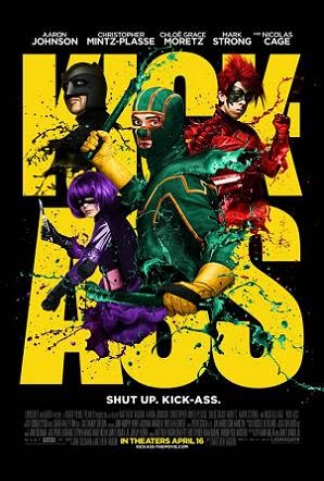
Mathew Vaughn's "Kick Ass" is about to be release next week. It has tons of villains with guns and heavy firepower. I'm curious to see how Hit Girl and Big Daddy overcome this adversity. I hope they kick ass properly.
Thursday, April 8, 2010
Typography - the Art of the Intro
Opening credits for movies can be time consuming and laborious when you want the movie to "just get to the monkey". A boring intro credit will usually compel me to forward the introduction altogether; but once in while I'll dreadfully sit through the monotony from fears that I might miss some crucial information sprinkled within these uneventful images. Successful title sequences will usually layout a definable purpose or meaning of a particular movie. It will succinctly compose a visual understanding of what we the audience are about to experience.
In David Fincher's "Panic Room," the title itself embodies the sheer brevity and magnitude of what the film tries to accomplish. It opens with a magnificent shot of Manhattan and eventually works its way up to the Upper West Side.What makes these shots so stunning is how The Picture Mill (the title sequence designers) decided to incorporate the fonts into the shots.

They deliberately chose a modified version of the copperplate font which naturally and architecturally fits the visual motif of New York City perfectly. The copperplate font with its sharp protruding serifs, powerfully erected stems, claustrophobic apertures, and stabilizing crossbars innately captures the architectural definition of New York City. Instead of using these fonts as a formulaic set piece to mechanically introduce the credits, they intentionally fused the copperplate font directly into the shot as an extension of the city itself. Attaching them to various monumental and iconic buildings throughout the city, the font itself becomes a part of the city; panning, zooming, and moving along with it--almost like a billboard or neon sign, but much more elegant and imposing.

Although the Panic Room's opening title sequence seems to be inspired and borrowing heavily from Alfred Hitchcock's "North by Northwest," it certainly takes it to the next level by utilizing current cutting edge technology. The obvious observation is that they both open in New York City and the font is laid according to the convergence of the horizon -- it is never just laid flat on the screen. Where they differ are in the use of the font selection and how they interact with the shot. In North by Northwest, the font is animated, credits falling down from the top (North) and sliding out from the right (West) of the screen; whereas, in the Panic Room, the font is fixed firmly to a specific location. Another difference is that the font is two dimensional in North by Northwest but it is three dimensional in the Panic Room, occasionally shifting it's perspective.
I can't express enough about how much I appreciate the opening title sequence. Although I didn't enjoy the overall narrative structure of the film itself, David Fincher never ceases to entertain me with his shot compositions and the brilliant use of his opening credits. The Panic Room's opening title sequence immediately pulls you in and elaborately explains to the viewer with precise craftsmanship the kind of brick-and-mortar setting and concrete atmosphere that is about to be experienced.
Sunday, April 4, 2010
We put the cars back in space cars!
So one of my class projects had me design a concept car. I'm not a designer nor an engineer by trade so the thought of designing anything remotely convincing put me in a creative rut for a couple of weeks before hatching the semblance of a decent "car." My instructor George Kontos urged me to check out this book called "Cosmic Motors." It's a concept book about designing futuristic space machines. Although they do some cool stuff in the book, the designs were a little too unconventional for my taste. It provided me with a perspective though: I knew that I would design a futuristic flying space car: it had to fly and I wanted it to resemble a classic muscle car. Now the question was, "why did I want to conform the design to an old standard?" The setting is suppose to be the future for fucks sake...2125 respectively; shouldn't the design reflect the changing time?
I don't know what cars are going to look like in the future, but judging by films like the Fifth Element, they really haven't changed that much; except that the cars themselves don't have tires. That was my start off point. I eventually came up with sketches of my concept car.

Now I needed a story behind the design and explain why the shape hadn't evolve to ground the fiction. So, in 2125, generic looking space cars with their rounded aerodynamic corners and circular flying saucer-like chassis designated for safe functionality ruled the skies. Theses designs were so uninspired and dull, bored rich elitists clamoring for nostalgia idling in their floating mansions and re-watching Steve McQueen's Bullit on hologram projections yearned for something much more classical and tough. That's when I came up with the idea for Tarmac Sky. Tarmac Sky is a space car manufacturing company that specializes in creating very expensive space cars that resembled old tough muscle cars like the Ford Mustang. Since the outdated shape for the chassis of these vehicles don't meet space flight regulations, Tarmac Sky hires specialized space auto engineers to make the designs work. These space cars don't come cheap and are only commissioned by the rich. Once the company was set, I needed a brand logo. Here are some sketches of Tarmac Sky's logo:

Here is the final rendered image:
.jpg)
Now that I have my fictional car company, brand logo and a brief explanation of the zeitgeist, it was time to build the EV-13 space car. I used Maya to complete my project. It took a couple of iterations before I settled for the final look. Here are some early renditions:
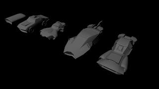
After a bit of modeling I realized that I was losing the classic, tough, and muscular aspect of what I was originally going for. It took a while before I settled on the final design. Here are the finished renders of the EV-13:


I wanted to keep the shape classically muscular as I could.


It wouldn't be a flying space car without some turbine and intakes. In the end, I think the EV-13 turned out pretty nicely. From an engineering point of view, it probably wouldn't get 2 inches off the ground, but hey, in my pipe dream, it's the next best thing to a DeLorean.
Celluloid Fury ignites
What's up fellow maniacs? Celluloid Fury is a blog that will compliment my personal website prophetsvfx.com. I can cost effectively elaborate on more of my work and projects here without having to spend any additional headaches worrying about being nickel and dime to death. Aside from discussing my personal projects, I will occasionally ramble on about the state of film, the movie going industry and what it means to be a self righteous film goer with an opinion and the means to impose it in our ever opinionated quarterbacking society...this should be fun.
Subscribe to:
Posts (Atom)
